
A logo that looks crisp on a large screen can become difficult to reproduce when it sits on a small label, folds around a carton edge or prints on a textured bag. Treat the logo as part of the package structure. Review its size, contrast, clear space, substrate and finishing alongside the dieline.
A packaging logo has to work on the real package
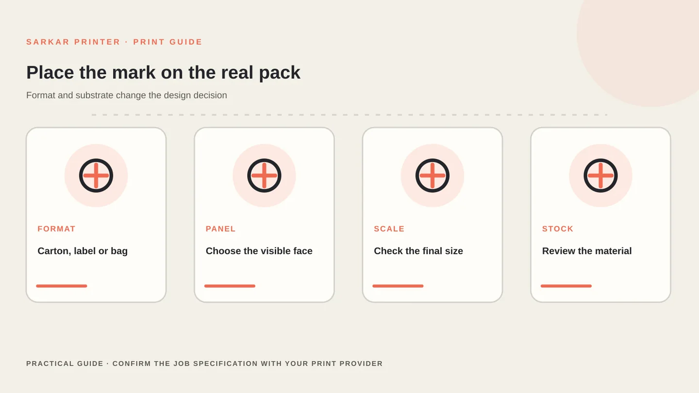
Start with the exact application: carton front, side panel, bottle label, paper bag or hang tag. A mark that works on a flat white proof may read differently on kraft paper, coloured board or a coated surface. Ask the printer what the selected material can reproduce and request a sample when the surface changes the appearance.
Keep production artwork separate from a visual mock-up. Our product-label file checklist and packaging design guide connect brand artwork with print and panel planning.
Choose a suitable logo file and keep its proportions
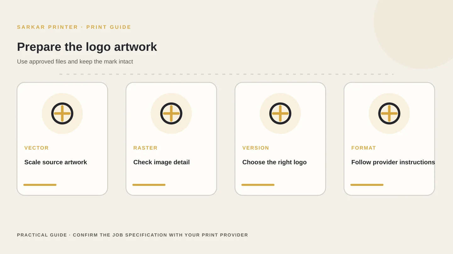
Vector artwork usually scales cleanly because it describes shapes mathematically. A high-resolution raster file can also work when it has enough pixels for the final printed size. Ask for the original vector file or a provider-approved PDF, AI, EPS or SVG format instead of enlarging a small web graphic.
Keep the approved logo proportions. Do not stretch it to fit a panel or add unapproved effects. If the brand team supplies colour, one-colour and reverse versions, include the correct option in the artwork package and label each file clearly.
Before sending the job, check that fonts are embedded or outlined as the printer requests, linked elements are included, and the file uses the finished dieline. Adobe explains print PDF settings such as bleed, marks and colour conversion; follow the output settings specified by your provider.
Check contrast, detail and colour on the chosen stock
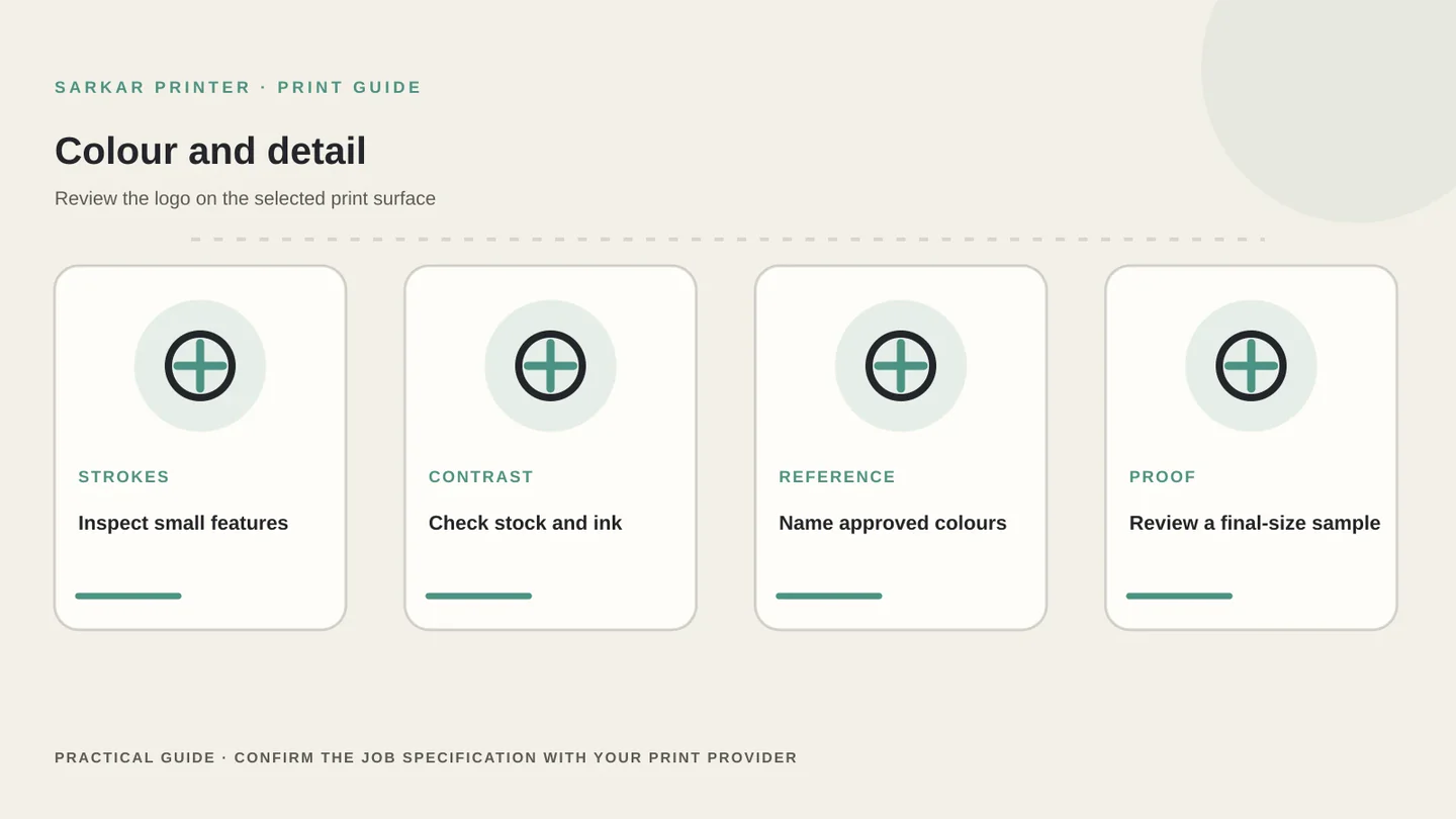
Small counters, thin strokes and fine type may close up or disappear at reduced size. Print the logo at its actual dimensions and inspect it on the package panel. If the artwork includes a tagline, manufacturer line or small registration mark, verify that the text remains legible after printing and finishing.
Colour depends on the chosen stock and print process. A specified spot colour, CMYK build or white-ink layer may need different treatment depending on the press and substrate. Ask the print provider how to supply artwork and how the team will check the result. Do not assume a digital screen or home printer can match a production press.
Give the printer the logo’s intended use, colour reference and priority. For colour-critical work, compare the proof or printed sample under agreed lighting and record any approved adjustments. Read our commercial print colour accuracy guide for a practical review framework.
Place the logo around folds, seams and required content
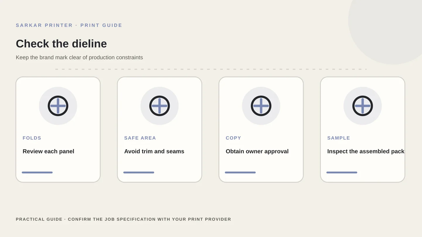
Use the printer’s current dieline and keep the logo inside the safe area. Check how each panel folds into the finished carton, where glue or seams sit and which face customers see first. Do not place key marks across a crease or trim line unless the package design calls for it and the printer confirms the placement.
Keep the logo clear of barcodes, variable data, required product copy and closure features. Packaging may need additional copy or marks depending on product, market and category. Have the responsible brand, legal or compliance owner approve required wording and symbols; a print provider cannot replace that review.
Before release, compare the flat artwork, a 3D mock-up and a folded sample when possible. The mock-up helps with panel hierarchy, while the printed sample confirms the physical result. Explore packaging printing or send the artwork for a print discussion.
Packaging logo artwork checklist
Use this checklist before sending a carton, label, bag or tag file to print.
| Check | What to review | Who confirms |
|---|---|---|
| Source file | Vector original or suitable final-size raster artwork | Brand or design owner |
| Proportion | Correct logo version, spacing and orientation | Brand owner |
| Colour | Approved colour reference for the selected stock | Brand owner and print provider |
| Placement | Safe area, folds, seams, glue and barcode zones | Packaging designer and printer |
| Proof | Final-size detail, contrast and assembled appearance | Approver listed on the job |
CONTINUE THE PRINT PLAN
Make the next print decision with a clear brief.
Send the package format, dieline, logo file and approved colour reference. Explore packaging services, printed boxes, or contact our print team.
Frequently asked questions
What file format should I use for a packaging logo?
Ask the printer for its preferred format. A vector original is useful for scaling; a raster logo needs enough image detail for the final printed size.
How do I keep a logo readable on a small label?
Review it at the actual printed size, check thin strokes and small text, maintain contrast on the chosen stock and approve a relevant proof.
Can I use the same logo colour on kraft and white packaging?
The same colour values can look different on different substrates. Share the intended stock and colour reference, then ask the printer how to proof the result.
Where should a logo sit on a folding carton?
Place it using the current dieline and review the folded panels, safe areas, seams, glue zones and required product information before approval.