
Devanagari text needs careful layout review because its marks and letter forms interact above and below the main line. Devanagari typesetting for print should include a fluent proofreader and a check of the exported PDF, not just the editable document.
Proof the actual glyphs and word shapes
Inspect matras, conjuncts, nukta characters and punctuation in the final font. Look for marks that overlap, detach or sit too close to the next line. Check headline breaks and long compound words in context. A screen may show the text correctly in one application while the exported file substitutes a glyph or changes spacing.
Use a typeface with the required character support and follow the design software’s recommended text handling. Keep font files under the team’s license and confirm that the printer can render the supplied PDF. If your team converts any text to outlines, retain a live-text source file for future edits and ask the printer whether that approach suits the workflow.
Make reading comfortable at the finished size
Choose line length and leading that give the script room. Avoid forcing a complex paragraph into a narrow column. Check the smallest Hindi text on a physical proof where possible, including contact details, footnotes and captions. Have a fluent reader assess both spelling and the natural flow of the language.
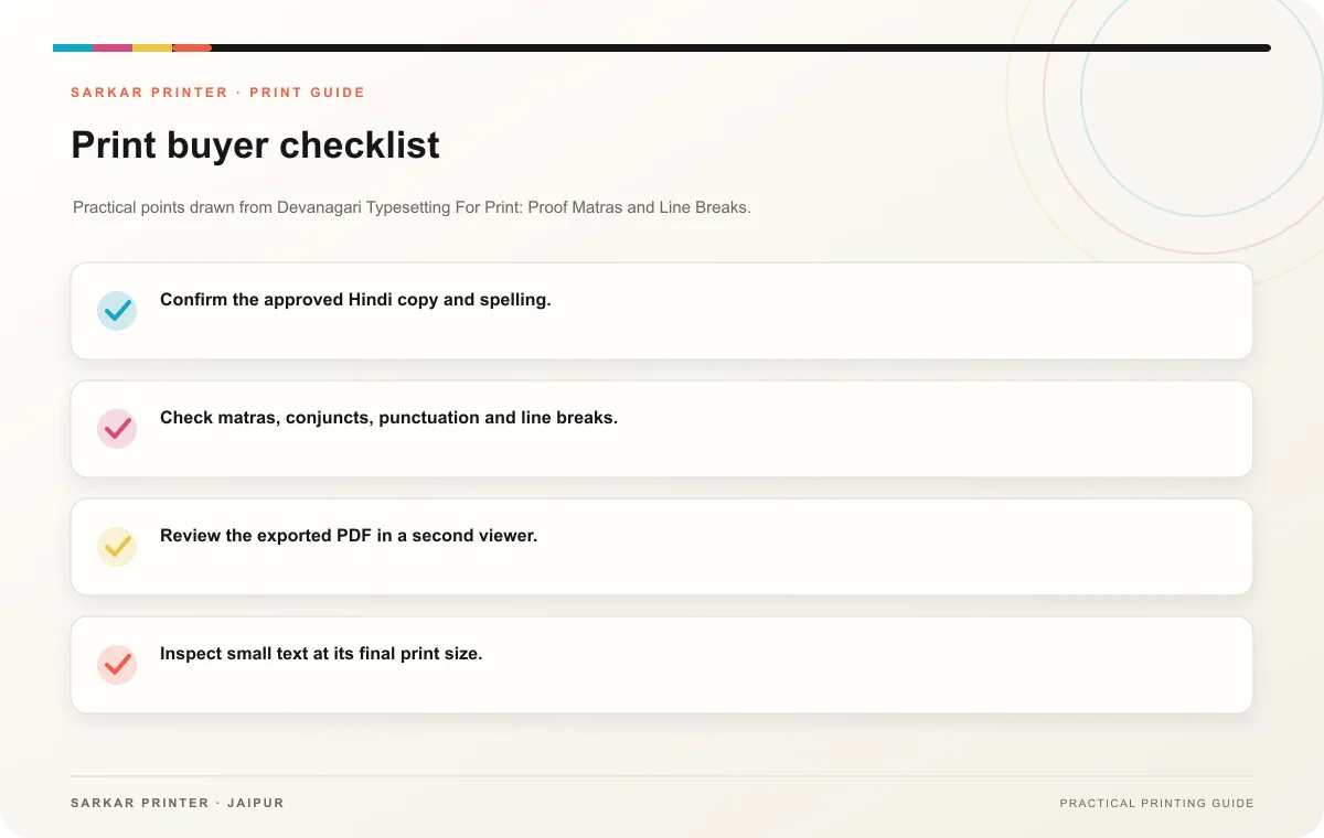
- Confirm the approved Hindi copy and spelling.
- Check matras, conjuncts, punctuation and line breaks.
- Review the exported PDF in a second viewer.
- Inspect small text at its final print size.
- Keep a proofed source and versioned final PDF.
Include language review in the approval plan
Assign a fluent proofreader before artwork lock. Collect corrections in one marked file and rerun the export after each revision. The reviewer should confirm the exact final PDF, because a later change can affect a line break or a word shape.
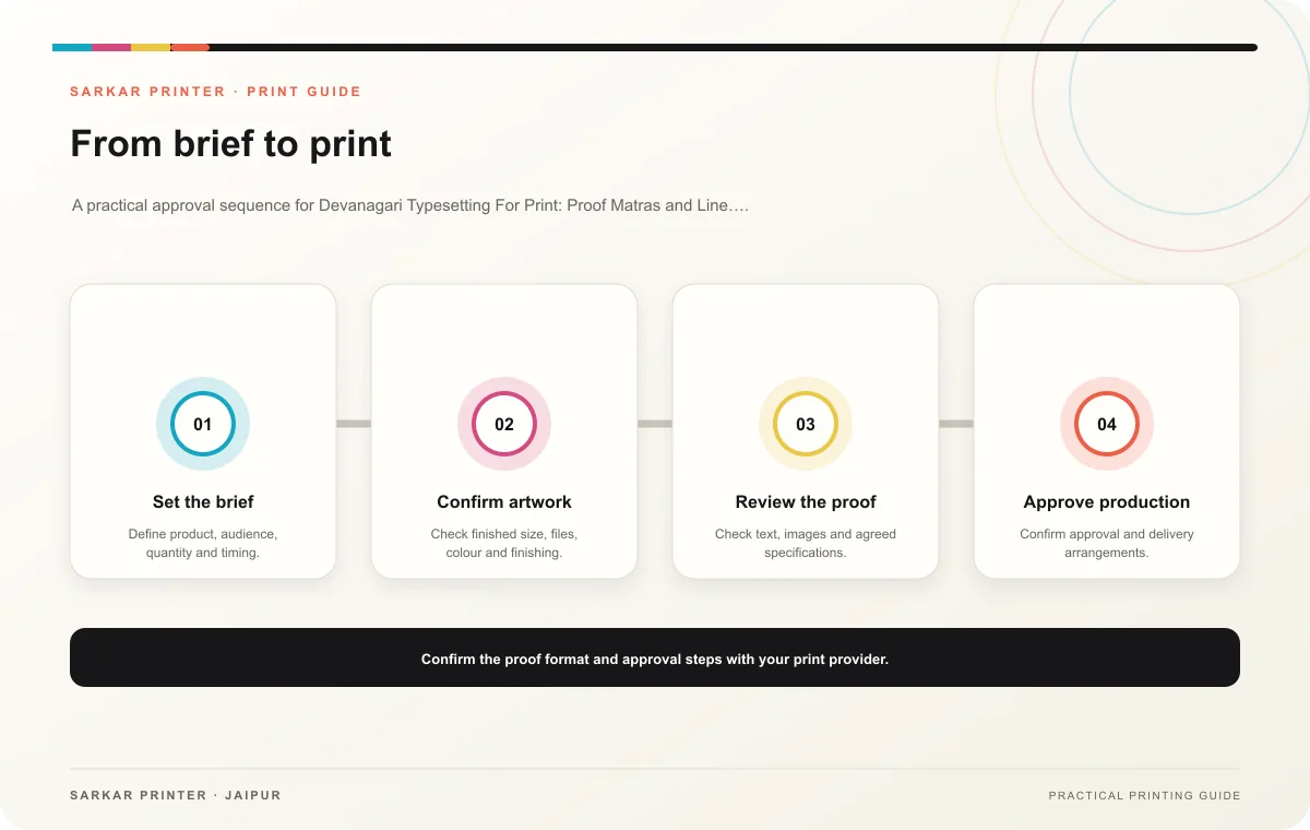
Print planning checklist
| Topic | Key point | Check before approval |
|---|---|---|
| Proof the actual glyphs and word shapes | Inspect matras, conjuncts, nukta characters and punctuation in the final font. Look for marks that overlap, detach or sit too close to the next line. Check headline breaks and long… | Review one dated proof under suitable light before approval. |
| Make reading comfortable at the finished size | Choose line length and leading that give the script room. Avoid forcing a complex paragraph into a narrow column. Check the smallest Hindi text on a physical proof where possible,… | Confirm the finish on a sample and check that it suits the artwork. |
| Include language review in the approval plan | Assign a fluent proofreader before artwork lock. Collect corrections in one marked file and rerun the export after each revision. The reviewer should confirm the exact final PDF, because… | Review one dated proof under suitable light before approval. |
CONTINUE THE PRINT PLAN
Keep the next step useful.
Explore the service page or related drafts, then send the agreed brief to the print team.
Frequently asked questions
Can I trust the on-screen preview?
Use it for a first review, then inspect the exported PDF and a physical proof when small details or rendering differences matter.
Should Hindi and English use the same font?
Use typefaces that work together visually and support each script. Check both at final size.
Who approves the final Hindi file?
A fluent reader should verify language, and the design owner should confirm the approved file version.