
Consistent typography helps customers recognize a brand across business cards, brochures, menus and packaging. Consistent brand typography in print starts with a small set of styles and clear rules for when to use each one.
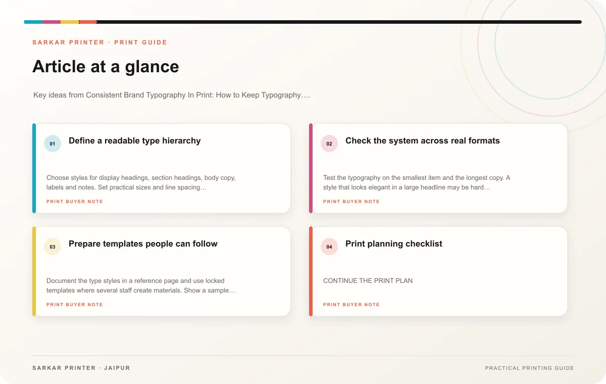
Define a readable type hierarchy
Choose styles for display headings, section headings, body copy, labels and notes. Set practical sizes and line spacing for the formats the business uses most. A large poster and a small tag will not use identical sizes, but both can follow the same hierarchy and visual character.
Limit the number of typefaces and weights. Use emphasis intentionally so important information remains distinct. If a font does not support a required language or character, choose a compatible alternative and review it with the other brand styles.
Check the system across real formats
Test the typography on the smallest item and the longest copy. A style that looks elegant in a large headline may be hard to read in a contact block. Review contrast on the selected background and stock. Keep type away from trims, folds and binding where it may become difficult to read.
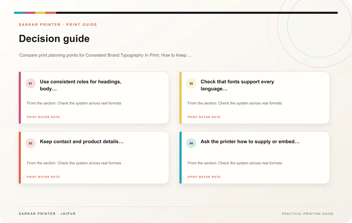
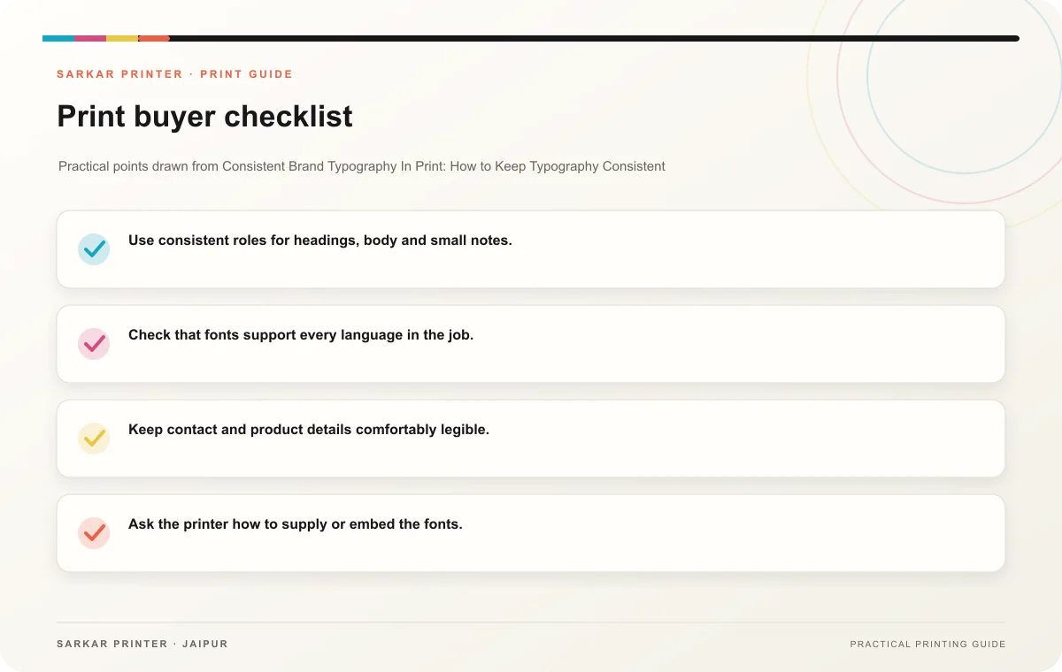
- Use consistent roles for headings, body and small notes.
- Check that fonts support every language in the job.
- Keep contact and product details comfortably legible.
- Ask the printer how to supply or embed the fonts.
- Maintain editable master files and approved PDFs.
Prepare templates people can follow
Document the type styles in a reference page and use locked templates where several staff create materials. Show a sample of correct hierarchy and identify which copy can change. Review a set of printed pieces together to catch drift in font size, spacing or emphasis.
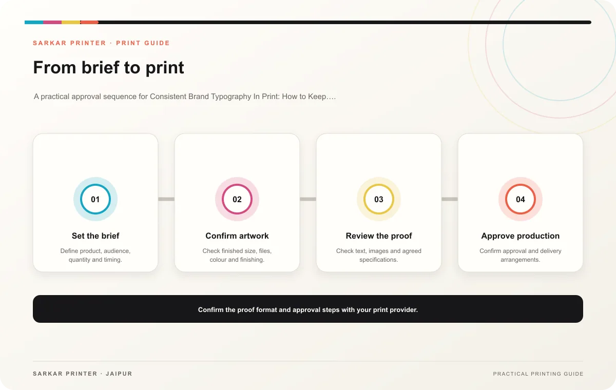
Print planning checklist
| Topic | Key point | Check before approval |
|---|---|---|
| Define a readable type hierarchy | Choose styles for display headings, section headings, body copy, labels and notes. Set practical sizes and line spacing for the formats the business uses most. A large poster and a small… | Record the agreed choice in the approved print brief. |
| Check the system across real formats | Test the typography on the smallest item and the longest copy. A style that looks elegant in a large headline may be hard to read in a contact block. Review contrast on the selected… | Record the agreed choice in the approved print brief. |
| Prepare templates people can follow | Document the type styles in a reference page and use locked templates where several staff create materials. Show a sample of correct hierarchy and identify which copy can change. Review… | Record the agreed choice in the approved print brief. |
CONTINUE THE PRINT PLAN
Keep the next step useful.
Explore the service page or related drafts, then send the agreed brief to the print team.
Frequently asked questions
Can a brand use different fonts for Hindi and English?
Yes, when the fonts support each script and work together in the shared hierarchy.
Should every item use the exact same type size?
No. Adapt sizes for the format while keeping style roles and readability consistent.
How do I keep a supplier’s file consistent?
Share the approved font rules, templates and final reference samples with the brief.