
undefined Verify package surface aesthetics using the Pantone Matching System and ensure raw stock conforms to FSC certified paperboard standards.
Start with the package and viewing angle
Choose structure, material and print method before final artwork. A box, paper bag, sleeve and label have different printable areas, seams and handling needs. Mark the front-facing panel and the surfaces customers are likely to see first.
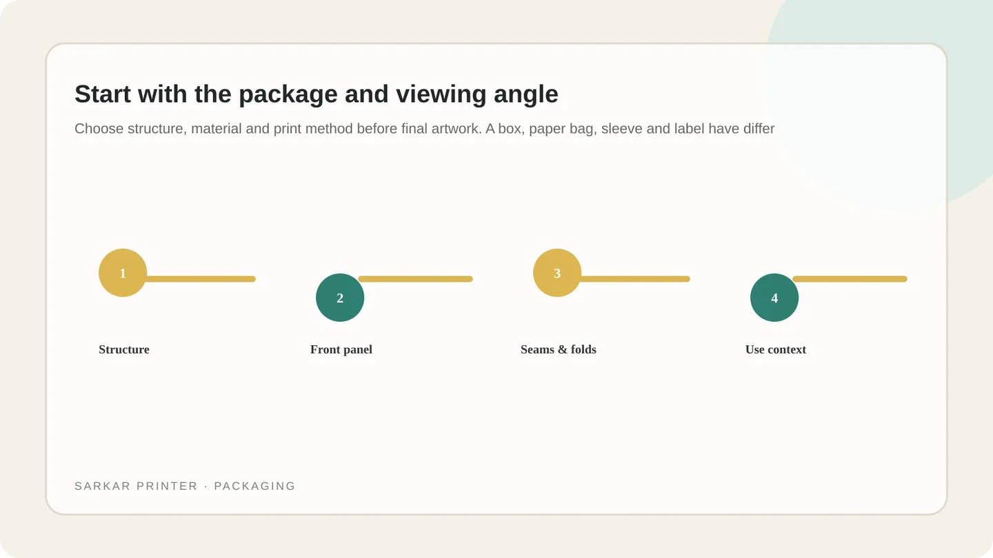
Use a dieline supplied or approved by the packaging printer. Keep critical text clear of folds, glue areas, cut lines and edges. Label panels and production marks so design and manufacturing teams review the same orientation.
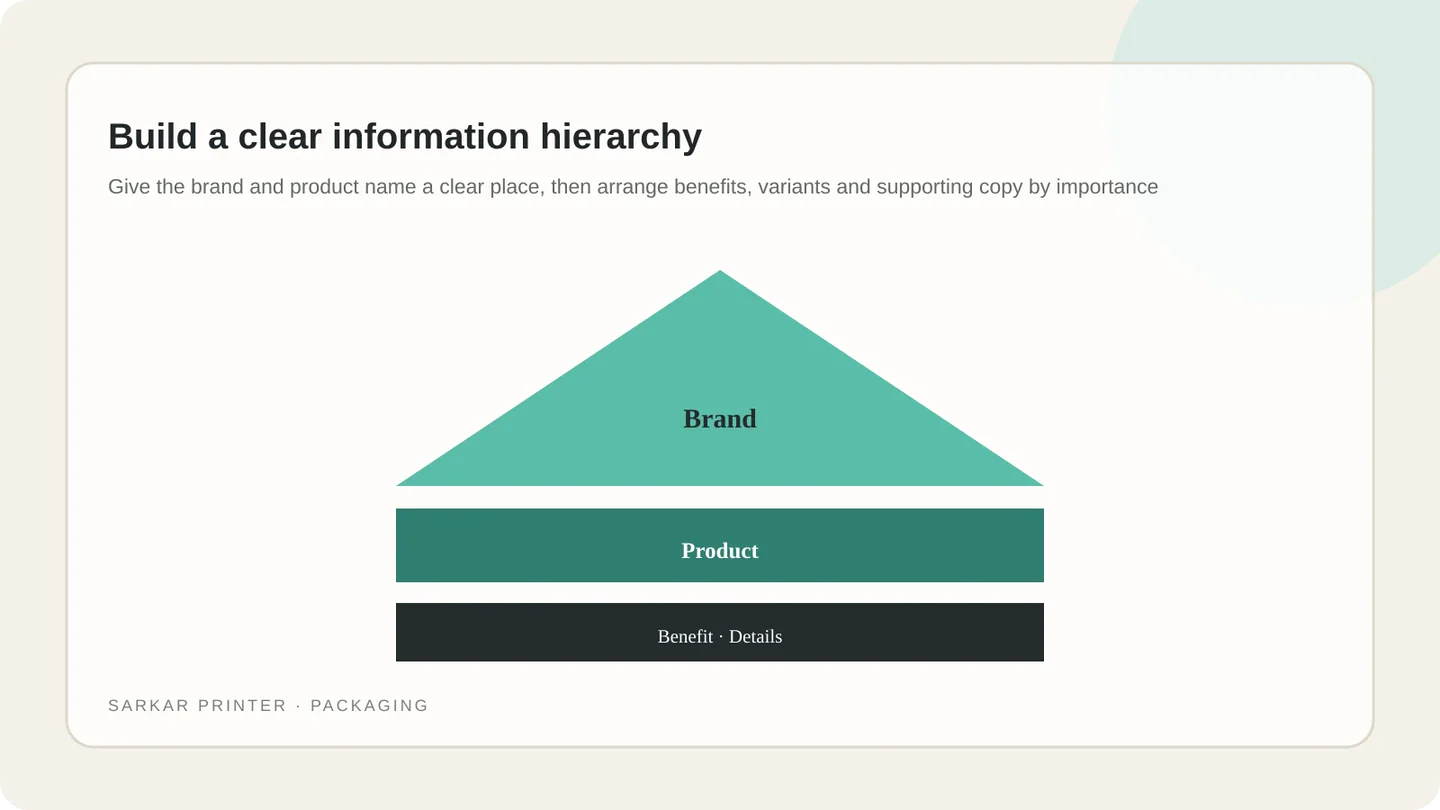
Build a clear information hierarchy
Give the brand and product name a clear place, then arrange benefits, variants and supporting copy by importance. Use readable contrast and consistent brand elements. Do not fill every panel simply because space is available.
Keep names and claims accurate, and have the responsible compliance team confirm required product information. For multiple languages or variants, use a repeatable layout that keeps each version readable and makes differences easy to review.
Design for material and print finish
Paperboard, corrugated board, labels and carry bags behave differently in print and use. Ask which colours, line weights, small type and finishes suit the chosen substrate. If a surface is textured or curved, test the design on a sample where practical.
Keep approved brand colours consistent and discuss critical elements with the printer. Spot inks, process colours, coatings and foil have different costs and limits; select them for a specific visual or functional reason.
Approve artwork on a realistic proof
Review the complete dieline and a folded or assembled mock-up. Check front-panel impact, panel sequence, text size, barcode space where applicable, image crops, folds and glue areas. Confirm that information remains legible at actual size.
Record approved artwork versions and verify each variant uses the right copy and graphics. See our packaging printing services, printed box options or contact the print team.
Packaging artwork review matrix
| Panel or feature | Design purpose | Check before approval |
|---|---|---|
| Front panel | Identify brand and product quickly | Hierarchy, contrast and legibility at shelf distance. |
| Side panels | Support the story and provide details | Copy, language versions and panel orientation. |
| Back panel | Carry supporting information | Accuracy, required content and readable type. |
| Folds and seams | Join panels in the finished structure | Clearance around folds, glue areas, cuts and edges. |
| Material and finish | Create the intended look and handling | Confirm stock, colour and finish suitability with printer. |
Plan the print job with a clear brief
Share the format, quantity, intended use and deadline. The print team can help confirm production details before artwork approval.
Contact Sarkar Printer ↗Frequently asked questions
What is packaging graphic hierarchy?
It is the order in which visual elements guide attention, often from brand and product identity to benefits and supporting details.
Should I design packaging before choosing the box?
Confirm the structure first. Its dieline and printable area determine where artwork can safely go.
How do I keep packaging colours consistent?
Use approved colour values and ask the printer how they will reproduce them on the selected material. Review an appropriate proof.
What should I check on a packaging proof?
Review the dieline, panel order, fold and glue clearances, copy, variant details, images, small type and an assembled mock-up where possible.