
undefined Standardize sheet proportions against the ISO 216 paper size standard, and export final layout geometry following Adobe InDesign print-ready PDF guidelines.
Set realistic colour expectations
Most process-colour printing builds images from cyan, magenta, yellow and black inks. Printed appearance can differ from a bright monitor because paper, ink, lighting and finishing affect colour. Discuss colour-critical brand elements with the printer before approval.
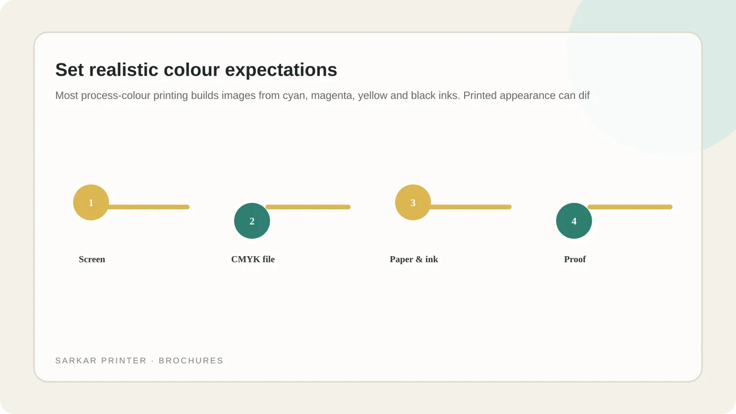
Use the printer’s profile and export instructions where provided. Avoid repeated colour-space conversions and do not judge a critical match solely from an uncalibrated phone or laptop display. A physical proof or agreed reference helps set expectations.
Prepare images and type for the final size
Place images at an effective resolution for their printed dimensions, and check blur, compression and crops. Keep small type readable and avoid thin lines or low-contrast text. For artwork to the trim edge, include the specified bleed.
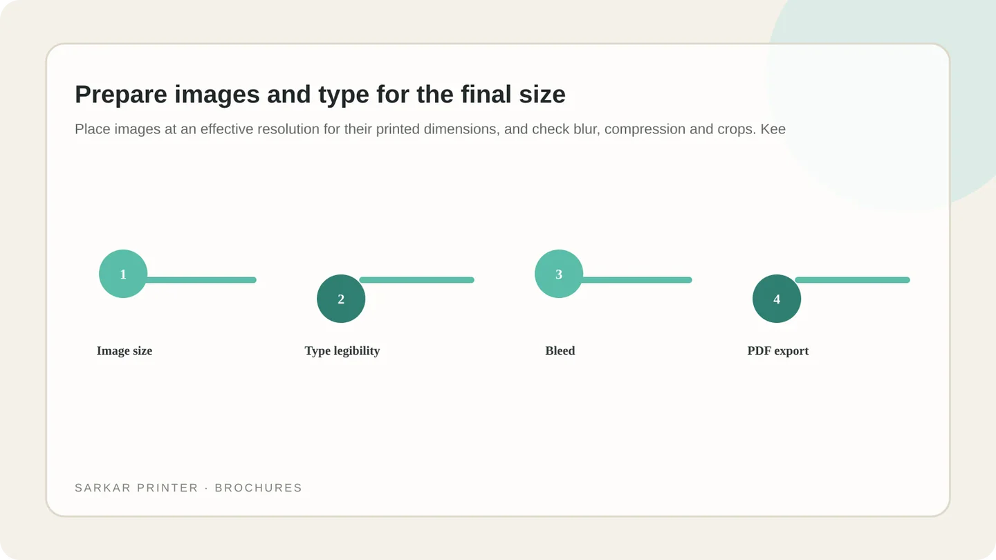
Use the requested PDF standard, embed fonts or convert them as instructed, and confirm linked graphics are included. Check transparency and overprint settings if used. The printer’s file requirements should guide export.
Choose paper and finish for the brochure’s use
Paper weight and surface affect folding, writing, colour appearance and feel. A coated sheet can render photographs differently from an uncoated sheet; heavier stock may feel substantial but need a suitable crease for folding. Match stock to format and handling.
Ask for available samples or recommendations for your quantity and fold. Lamination, varnish and other finishes can change appearance and handling. Confirm that the finish suits the fold, page count and delivery plan.
Review a proof before approving production
Read the proof at intended size. Check spelling, image crops, page order, panel orientation, phone numbers, URLs and brand colours. For folded brochures, use a folded sample to verify the cover and reading sequence.
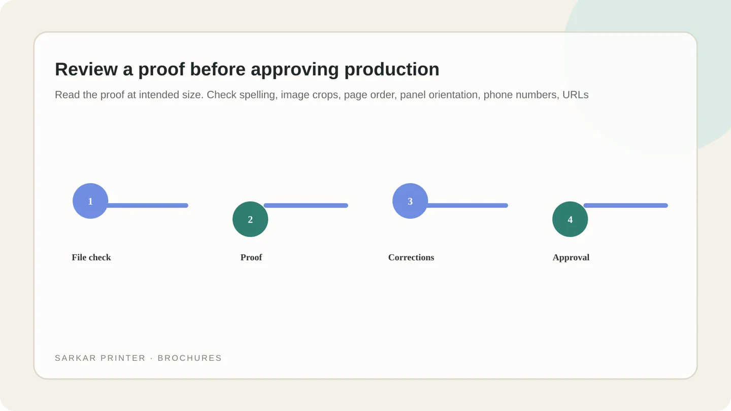
Make corrections in the source artwork and request another proof when changes affect content or colour. Keep one approved version for production. Explore brochure printing and offset printing, or send your print brief.
Full-colour brochure production choices
| Decision | What it affects | Question to ask |
|---|---|---|
| Process or spot colour | Colour reproduction and special brand colours | Does the job need CMYK, spot ink, or both? |
| Paper surface | Image appearance, writing and feel | Which stock suits the artwork and audience? |
| Fold and format | Reading order and finishing | Will the selected paper fold cleanly? |
| Proof type | How colour and layout are reviewed | Which proof suits the job’s colour risk? |
| PDF settings | Fonts, images, bleed and readiness | What export preset does the printer require? |
Plan the print job with a clear brief
Share the format, quantity, intended use and deadline. The print team can help confirm production details before artwork approval.
Contact Sarkar Printer ↗Frequently asked questions
What does full-colour brochure printing mean?
It usually means process-colour printing such as CMYK, though the final setup depends on the artwork and printer’s specification.
Will printed colours look exactly like my screen?
Not necessarily. Displays emit light while print reflects it. Paper, inks, finishing and viewing conditions also affect appearance.
Do I need a colour proof for every brochure?
A proof helps check layout and colour. Choose the type based on the job’s colour risk, budget and production plan.
Which paper is best for a full-colour brochure?
There is no single best stock. Choose based on images, writing needs, fold, quantity, handling and finish, then confirm availability.